I wanted to write an article about SKIMS precisely because I did not actually know anything about SKIMS.

Other than:
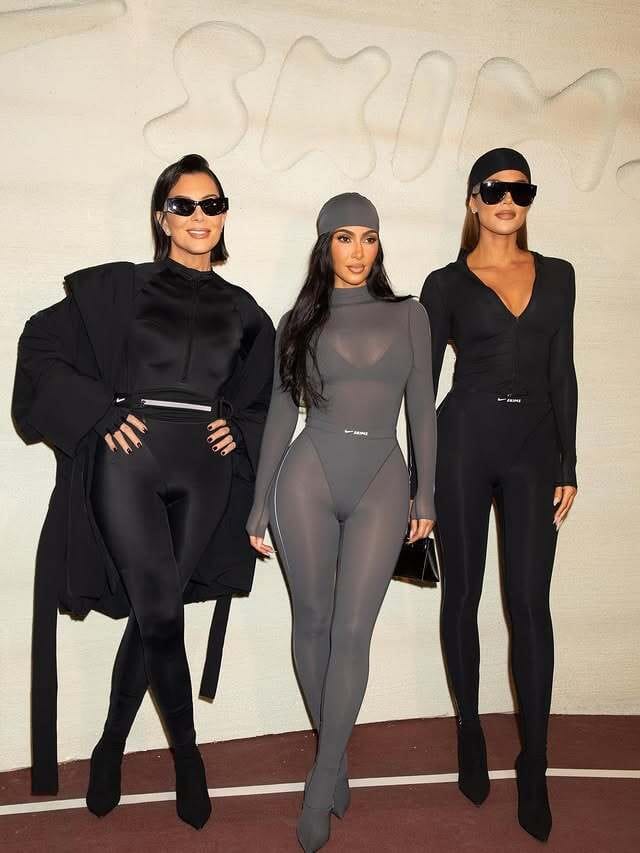
It was co-founded by Kim Kardashian.
As I said, I didn’t know anything.
And I’m not sure why I used a bullet point there.
So, I started learning.
I spent a few hours on SKIMS’ site and reading articles about SKIMS to learn about the brand and figure out an interesting angle here.
Shocking nobody, much has been written about SKIMS.
In particular:
SKIMS’ influencer strategy: Ranging from Kim herself to their influencer tiers, from nano- (<10k) to mega- (1m+) influencers.
Brand collaborations: Fendi, Swarovski, The North Face, Nike…
Celeb faces of SKIMS: Charli XCX, Usher, Sabrina Carpenter, Kate Moss, Donovan Mitchell, Rosé, Tyra Banks, Patrick Schwarzenegger…
I do want to emphasize that there’s good reason all of this has been covered: each of these elements is brilliant and worth going down Nerdy rabbit holes over.


In particular, their celeb/brand partnerships strategy is so frickin’ smart.
Each unlocks new audiences and gets SKIMS in front of bajillions* of new eyeballs. Their Rosé collab from Valentine’s Day, for example (instagram launch pic above), has nearly 4 million likes, and I have to imagine at least 20–30x as many impressions. Even though Kim’s IG reach is only surpassed by 7 accounts—including Instagram’s own account—getting in front of other huge and hyper-dedicated audiences (e.g., K-pop fans) is some chef’s-kiss-strategy.
Actually, I really wanted to write about NikeSKIMS because I think that might be the GOAT partnership from an audience-unlock standpoint, but again, I’m late to that conversation.
*i.e., a lot
Where I’ve Landed: On SKIMS’ Site Itself.
As a certification-pending Nerd Marketer, I’ve been on a DTC site or two.
I’m far from an expert, but I peruse dozens of sites every month to see how site designs and UI/UX are evolving, and I found a collection of little details on SKIMS’ site that are pushing the envelope, hitting best practices, and almost certainly powering stronger revenue/CVR/AOV.
Here’s what I found.
1. GIFs of Models on Product Listing Pages (PLPs) [Innovation]
SKIMS is either testing or starting to more thoroughly implement GIFs on their PLPs, and I am here for it.
Check it out:
This is just a couple of product rows, but in looking on other PLPs, it looks like they’re adding 1–2 GIFs per row.
So, I might just be accidentally reporting on a CRO test.
But it’s a great one.
Prior to taking that recording, I actually clicked on a PDP with a GIF preview before clicking on a static PDP preview, and I’m betting many others have done the same.
It naturally draws a click, because I’m:
Learning more about the GIF’d products vs. the static ones: I can see a bit more, even simply in terms of how the item falls on someone’s body, which might influence my purchasing decision.
Seeing something dynamic: This is a new experience on PLPs, so it draws the eye. It drew mine, anyway.
I’m not sure if the right move is to GIFify everything, but I suspect that SKIMS’ CRO team will have an answer to that sooner rather than later.
If it turns out that this does influence sales/CVR, it’d be a great tactic to use to push velocity even faster on bestsellers, and potentially, to move through slower-moving inventory.
2. TLDRs/Above-the-Fold Reasons to Buy on PDPs [Great Practice]
I love to see above-the-fold information on apparel PDPs.
It’s space for an immediate burst of brand voice or product education.
I tend to see it a bit more among other verticals, like on health/supplements sites, where you see checklists, use cases, etc., at the top of the page.

SKIMS adds “Why we love it” call-outs in the bottom-right of their PDP hero sections.

These are effective not only because they’re boxed (which draw your eye more than plain text on a white background) but because the language used gives a vibe for the products. In the case above:
luxe
cashmere
unmatched softness
premium comfort
The word choice emphasize the “softness.”
It makes you want to buy and jump into them.
There’s also a below-the fold portion of the box which gives a couple quick hitting benefits:

Again, repeating SOFT, plus, talking about the fit (“flattering”).
I’d even go so far as to say “silhouette” is a “soft-sounding” word, which further aligns this copy with the product.
3. Pushing Limited Edition Colorways/Designs Higher on PDPs [Innovation]
SKIMS runs a drop model, where they blast relatively limited inventory to drive urgency.
And for many of their products, they have both neutral (“Classic Shades”) as well as seasonal/special colorways (“Limited Edition”).

I’m guessing that the limited editions have even-more-limited inventory, too, so the fact that they’re presented separately and above the classics likely increases sales velocity.
Having “Limited” separate does push the idea of “this is different, this is special, so you should buy me.”
4. Little Hover Details on PDPs [Innovation]
Another small detail here, but it’s an example of how SKIMS packs in extra information and/or drives-to-buy.
When you hover over some colorway icons, you might find an extra reminder that it’s on sale…

Sub-detail is that colorways on sale have a little red dot underneath
Or that something’s out of stock at the moment.

Note that it doesn’t say “Out of Stock,” it says, “Waitlist.”
Either way, it’s a little extra nudge toward a conversion.
Whether that conversion is driving the browser to buy now (with an extra sale reminder) or buy soon (when the product is back in stock—in this case, they’re being pushed to “Join the Waitlist”).
5. Color Alignment on PDPs [Innovation]
Another small detail here.
But it’s one that does seem to psychologically pull you down the page and toward purchase.

When you choose a color + size of a SKIMS product, the CTA (“Add to Bag”) button’s color appears as the color you’ve selected.
It’s pleasing, and it aligns your choice with “buy this.”
6. Emphasizing Image Reviews On PDPs [Best Practice + Innovation]
This one is a great practice for social proof + community building, although I think SKIMS pushes it a step further.
In the reviews section of each PDP, SKIMS automatically sorts reviews with customer images to the top—no notes, and I’ve seen this on a few other sites.
What I think pushes this further:
SKIMS aggregates all the social proof images at the top (purple box) and turns them into a carousel:

By clicking on one of the images, you’ll be brought into a carousel of the images, which you can click through—and each one has the corresponding person’s review attached.

It’s like an onsite social media experience.
I specifically looked at a dozen-plus of SKIMS’ competitors’ PDPs, and while a couple had image-sortable reviews, none had this type of experience.
This has some obvious benefits:
Increases on-site time
Doesn’t rely exclusively on third-parties (i.e., social platforms) to show the everyday faces of SKIMS
Highlights customers’ own language/product descriptions in a UI that people are extremely familiar with and are comfortable reading in (looks like IG).
7. Cart + Checkout Wins [Great Practices]
Two things I’ll call out here:
Gift Bag for the Holidays: One of the all-time great AOV/margin hacks is offering a premium wrapping/bagging option.
Leading with savings: The big, bolded price I see is how much money I’m saving. And especially on a product bought on sale, it shows I’m saving a ton on the purchase.

Bonus points here: SKIMS shows the gift bag option on their checkout page, too.

Granted, having this option is premium, as not every 3PL offers the service. But if yours can do it…
It’s worth considering.
Keeping Up with SKIMS
I would imagine that if I dropped off the face of the earth for six months and came back to SKIMS’ site, I’d be able to find another cluster of innovations.
Some of what I highlighted here might even be gone.
Every site is a dynamic work in progress from an optimization standpoint.
Certain things that worked last year might not work this year because of trends and copycatting.
It’s part of the game.
But we can all learn from the best.
And SKIMS?
They’re among the very best.
